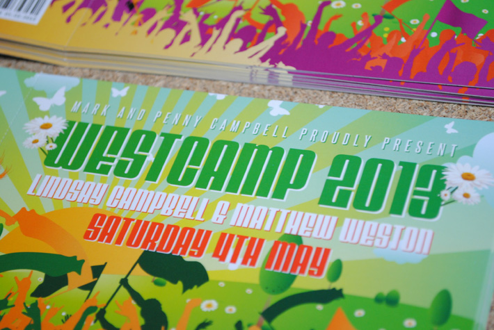
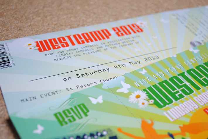
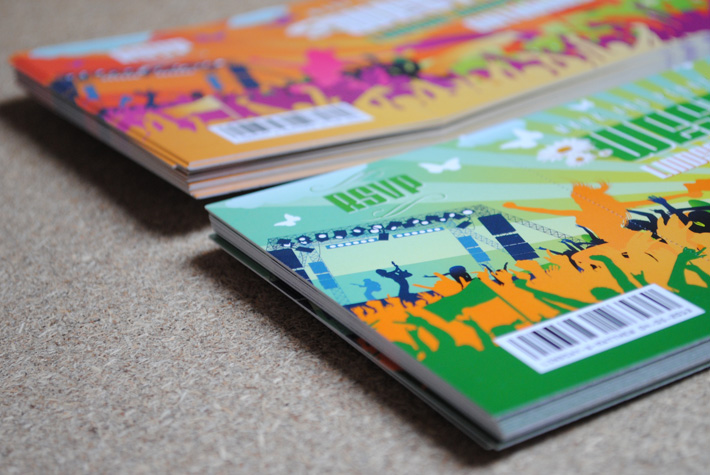
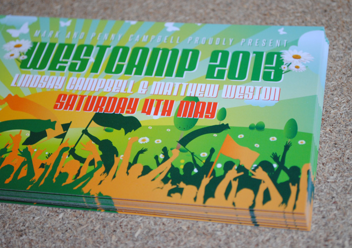
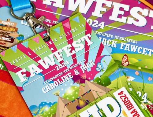
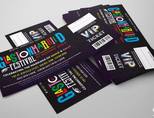
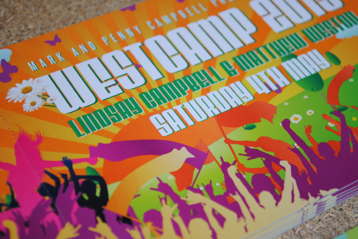
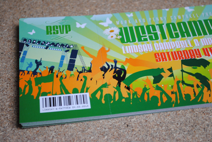
Festival Wedding Stationery – This is a set of ticket wedding invitations I designed for a couple called Lindsay and Matthew who wanted to have a festival themed wedding. For the title of the tickets instead of using WEDFEST which is what a lot of people have been using they combined elements from both their surnames to create WESTCAMP 2013 and I have to say it sounds and looks pretty cool, it could easily be the name for a real music festival. With the westcamp logo and the couples choice of colours plus some new elements I have been adding to the invites such as the rock concert stage, these invites look totally amazing.
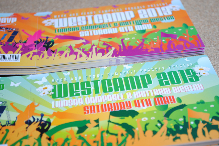
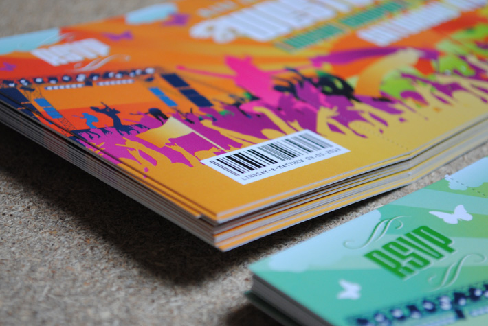
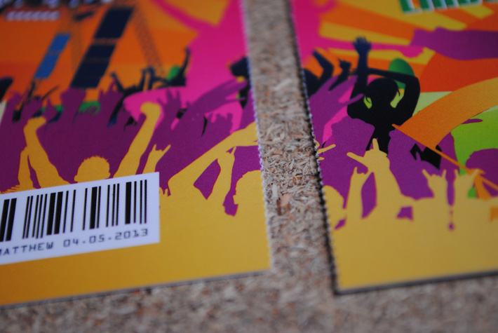
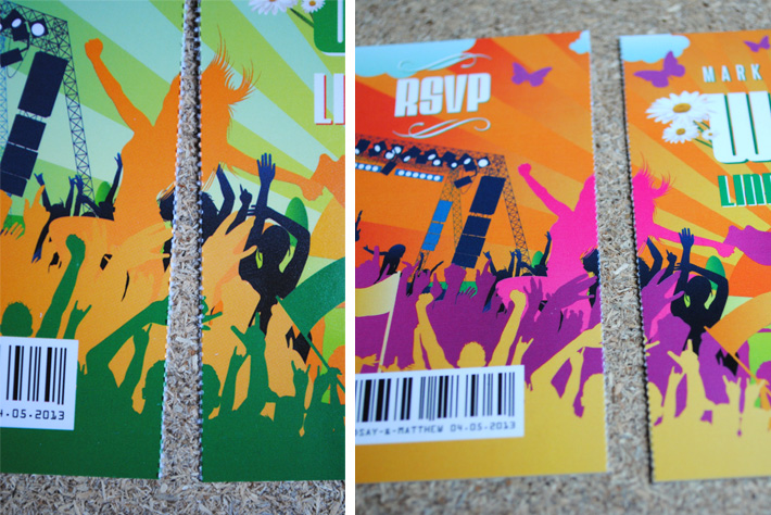
Again with the perforated ticket stub edge doubling as the RSVP card for the invites these ticket style invitations look and feel like real festival tickets. I also alternated the colour of the invites for the day and evening invites using the colours for the day to make it look like how a festival would during the day and then using sun setting colours for the evening invitations to give that feel of the sun going down at a festival. Keep an eye on wedfest.co for more new designs over the coming weeks as I have alot of new festival inspired designs I am looking forward to posting on here.
If you are interested in festival wedding stationery or would like more info on the festival ticket wedding invitations please click here to get in touch…
